“Data is the new Soil”
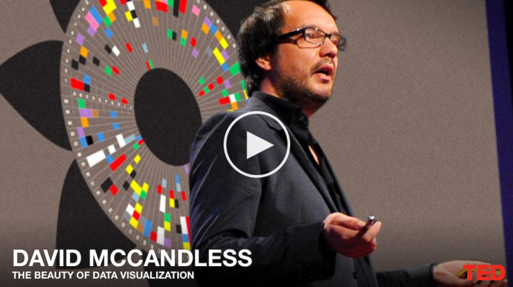
David McCandless describes data as the “new soil” since it’s a fertile medium that nurtures flowers of understanding. He creates aesthetically pleasing infographics that use shapes and colors to show patterns and connections in data, such as a 3D timeline called “Mountains Out of Molehills” that shows how non-issues (such as the Y2K bug) receive excessive coverage in the media during periods when there is no major news.
Visual information is effortless, the eye is sensitive and loves patterns; if you combine the language of the eye with the language of the mind, two languages work at the same time to alter a perspective and help us understand more as human beings.
References
McCandless, D. (2010). The beauty of data visualisation [Video file]. Retrieved from https://www.ted.com/talks/david_mccandless_the_beauty_of_data_visualization/transcript#t-247134
